Showing posts with label I. Research and planning. Show all posts

Monday, 10 December 2012

Masthead ideas

For my masthead for my magazine I have decided to stick with the idea of going for a girly theme, therefore I feel that I need to make sure that the main part of my magazine looks girly and appealing. I also came up with three different names that I would use for my magazine and they are all things that can relate to a 'girly' atmospehere, for example using the word 'amor' is spanish for love, and glamourous shows the aspect of beauty. I decided that my title may have a curly style as it comes across to ahve a bubbly and charismatic feel to it.

Front cover Drafts


Tuesday, 27 November 2012

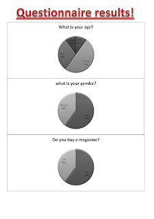
Questionnaire results


With the results that I received I found out that 50% of my audience was aged from between 16 and 18 years, therefore I feel like it would be more beneficial for me to aim my magazine towards this audience as they are they age more likely to read it. In addition 60% of my responses stated that they do buy a magazine.  60% of my responses were males, however I feel that I will still aim my magazine towards females as 40% still responded. I feel that if I incorporate content that both males and females may have an interest in there is a good chance my magazine would have a lot more readers. 50% of  my responses said that they would buy a pop magazine therefore this shows that my magazine would be beneficial as half of the responses would be willing to buy it. with the results with how much a reader would be willing to pay for a pop magazine I have learnt that they prices are split rather evenly therefore I feel that I would be able to find a price between nothing and 3 pounds. 40% of the results said that they would like the magazine to be weekly and although this is the majority I feel that I would still go for monthly as it would be more cost effective as only half of the results would buy the magazine and they would only pay between 0-3 pounds for a magazine. 50% of the responses said that they would contribute to the magazine by sending pictures that can be placed in the magazine, therefore as this was the majority I feel that this would be a good idea as it could attract more readers if they know that there are pictures of their friends in. With the results that I have gathered I have decided that I would also include things such as gossip, photo-shoots with the artists and also interviews. Pictures seem to be the most important aspect to a pop magazine as my results show that this would attract them to the cover.

Contents page analysis 2


Music magazine case study- Kerrang's technology and development


Tuesday, 13 November 2012

Target audience mood board and analysis

I decided that my target audience would be people that are interested in fashion and their image. therefore I create a mood board that was not only full of pictures of the type of people that would be attracted to my magazine but also the sort of people that my target audience would be wanting to see in the magazine. As my target audience are going to also be middle class people it is important that I ensure that I have things and people that my target audience will want to be like and have as a role model.

Monday, 12 November 2012

Advertising mood board and analysis

This mood board displays all of the types of things that my target audience would be interested in. it shows that there are alot of social networks on this mood board and this is becuase the target audience that I am basing my magazine on would spend a lot of time researching other people who are like them to keep up in trends that are going on and to find out any new gossip or news. In addition i feel that the types of shops that someone who would buy my magazine would go to would be shops such as new look and river island and this is most probably because they are well known and a lot of people go to these shops to fit in and sometimes to wear the latest fashions.

Colour mood board and analysis

this mood board shows the colours that my target audience would like and have an interest in. It is clear that my target audience like bright and vibrant colours and this could be due to them being popular colours, and as my target audience are fans of popular music it is obvious that these kind of colours would appear on the magazine. in addition these colours are very girly and this is due to my target audience being very girly and having an interest in cute things. therefore i felt that a lot of pinks and soft colours demonstrate this soft and cute image. although most of these colours are seen as rather similar and have a similar tone to them there are a variety of colours of this nature and this is where i will be able to create an appealing colour scheme to fit my target audience.

Font mood board and analysis


Tuesday, 23 October 2012

Double page spread analysis 2


This double page spread from kerrang magazine has a very dark colour scheme. This could be because this type of magazine is for an audience that have not only an interest in music but particularly Rock music. Therefore by using colours such as black and red demonstrate the kind of rock theme and draw readers who are interested in this type of music to want to read the magazine. In addition by using red to highlight the main parts of the article and for the drop cap can attract the readers to certain parts of the article. Black is a mysterious colour and by using it can demonstrate the mystery of what this band wants to achieve and this could attract the audience. It could also attract them because black can come across very dark and therefore if there is a band that a lot of people know about they may be curious. There is a side bar on the right hand side of this double page spread. This is where there is information that is linked to the article however it is not necessarily about the article itself.  This could be about tours of facts about the people. There are plenty of images on this double page spread and this could represent youth. This band is very young and by being young their livers are full of excitement and therefore by using plenty of images could demonstrate the excitement and youth that they are bringing to the world. Although there are five pictures the main one dominates the page and this signifies that this person may be the lead of the band. There is not much of a kicker on this double page spread; however there is a small one so it will give the readers an insight of what the article is going to be about. There is a pull quote on this double page spread however there is only one, and this is used as the title. It is used as that is the most important part of the article and y using it as the title/ opening it allows readers to be really eager to know what it going on.